Nature Tourism Services offers the creation of integrated digital content to support wayfinding, placemaking and interpretive products for all of our project work.
The bespoke solutions we use to do this have been developed and implemented by us in field conditions now for over a decade – ever since the start of the mobile revolution in the early 20 teens.
Our approach recognises that the form and function of the digital support must be customised to the needs of the given project.
Is there on site mobile coverage to support the delivery of webapp content via QR code link? If so how variable is this across the precinct and can a supporting smartphone interactive PDF guide be developed to download content for use in surrounding areas where coverage may drop out. In semi-urban settings is there 4G coverage on hand to support the inclusion of video content as part of the webapp platform?
The key point here is that all responses build upon the needs and circumstances of the site itself.
What does the manager need to communicate in this space in order to deliver a safe and meaningful visitor experience? How can they meet their user accessibility obligations to communicate with non-English speaking visitors and/or people with disability? Dual publishing content in HTML is recognised as the optimal means by which to do this. Extending this utility to signage is now an option commonly available to managers.
Modern users expect to access content of direct relevance to their immediate setting in their native language on a 24/7 basis. Managers seek to meet these needs in a manner that invites the user to understand their surroundings and attribute positive values and meanings to their experiences.
Considerations such as these underpin all of our digital interpretive responses.
The best app to deliver interpretive digital content is the one the visitor didn't have to download in order to access the information.
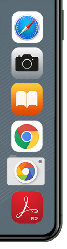
By using the apps provided either as part of the mobile device's operating system (e.g. camera, internet browser, iBooks) or else commonly downloaded products (e.g. PDF reader apps on Android), user accessibility is established as the platform on which interpretive digital product is developed.
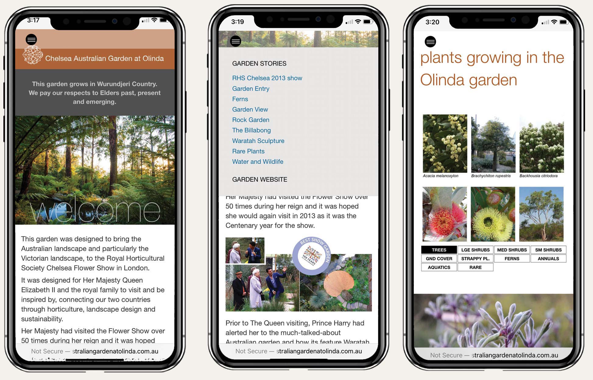
Thanks to the rise of webapp technologies in the wake of the 2014 final roll out of HTML5, service providers no longer need to wrap up their content in a coded app package simply to deliver basic information in a quality browsing environment.
This has direct and material benefits to both the supplier and user of the interpretive digital service alike.
user accessibility
The mobile revolution offers for the first time the chance to put user accessibility as a first order consideration in the delivery of both interpretive and visitor orientation material.
Prior to this there was simply no effective way to offer this information in more than a handful of languages at best. Then there were the many challenges of dealing with visual impairment and of striking a balance between the optimal viewing heights of people standing versus those in wheelchairs.
Over the course of the first mobile decade from 2010-20 it has become widely recognised that publishing content across print, PDF and HTML formats is now a central part of agencies meeting their user accessibility obligations.
The chance now exists to extend this approach to include communicating with visitors to outdoor places with no user wi-fi and potentially patchy internet coverage. The benefits to both managers and visitors alike from adopting this approach are significant.
for managers
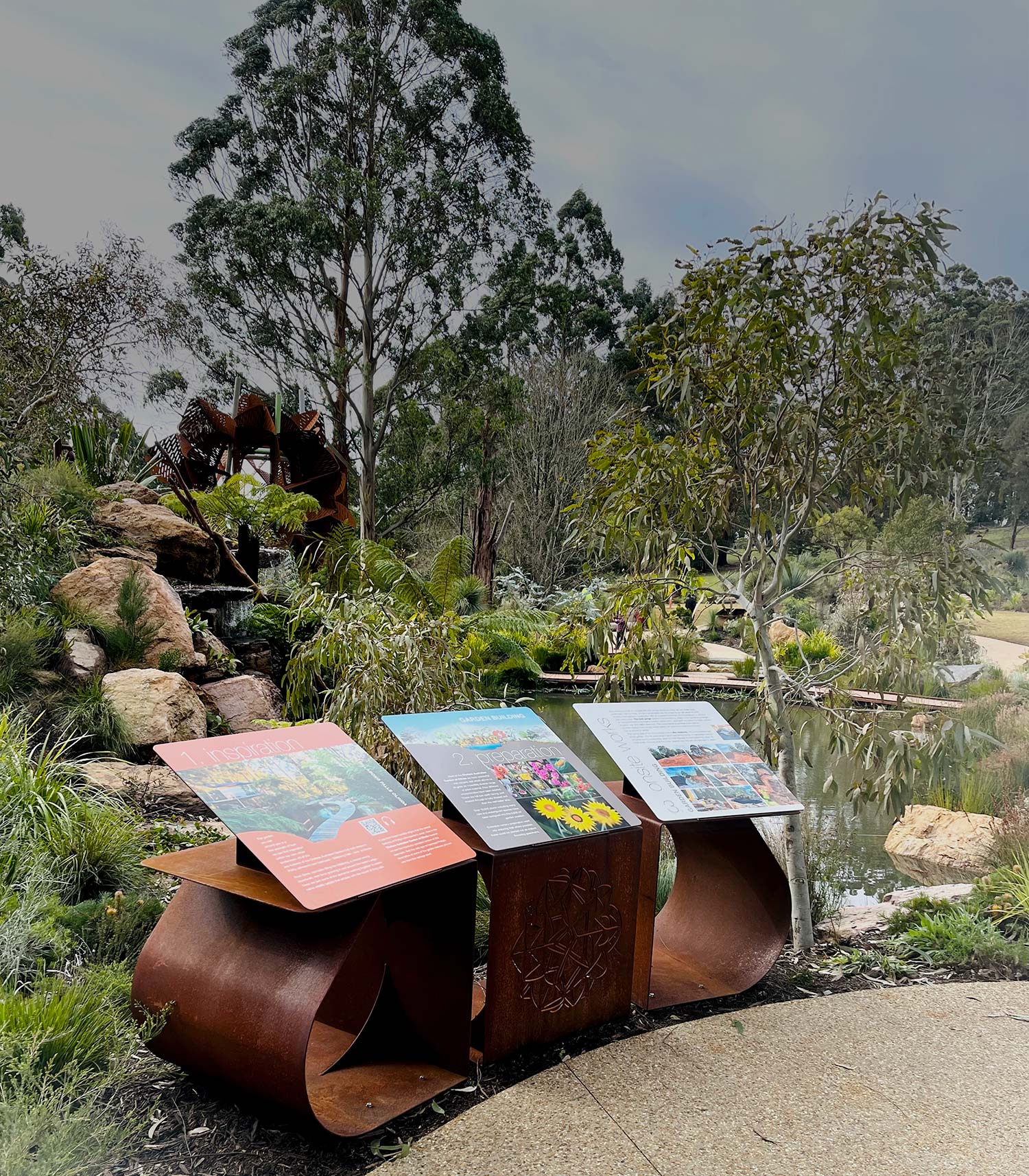
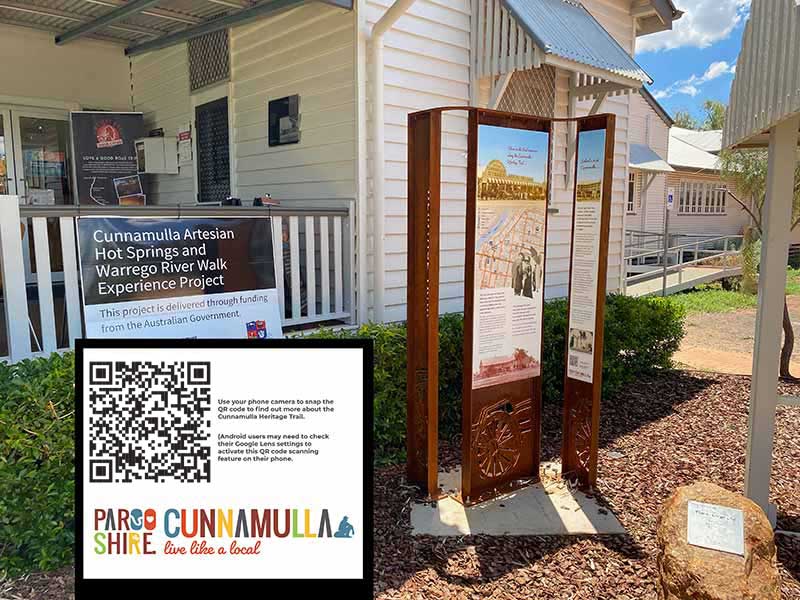
Some level of signage in natural areas will always be essential.
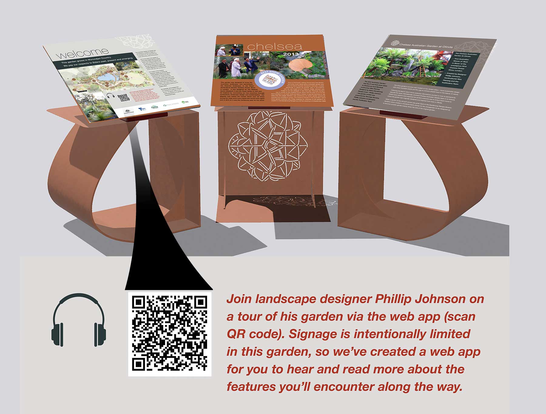
The question for a modern age is not whether we need signage, but rather how we can reduce our reliance on it while also using it to provide a portal connecting visitors with a richer online world.
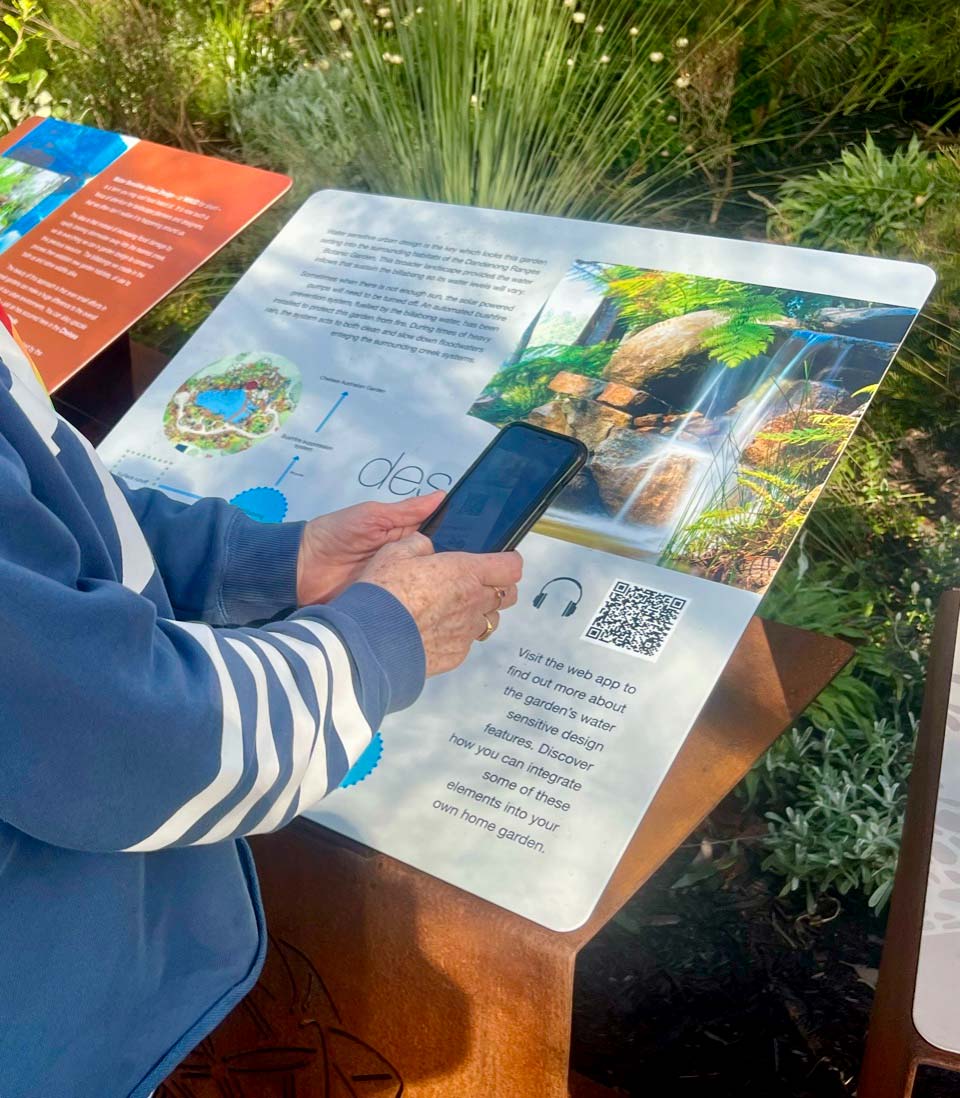
Content delivered via the user's mobile device doesn't fade in the sun, can be read in the user's preferred language, is very hard to vandalise, has no adverse environmental impacts and can be quickly updated as needed at minimal cost.
What it is often lacking with digital content however is location specificity. Websites by their nature deliver generic content of utility to visitors irrespective of their location. Signage by contrast is essentially site specific. It speaks directly to the immediate needs of people positioned beside it.
For digital content to have the same utility as a sign in a management setting, it must be delivered in a context that speaks directly to the needs of visitors in a specific location.
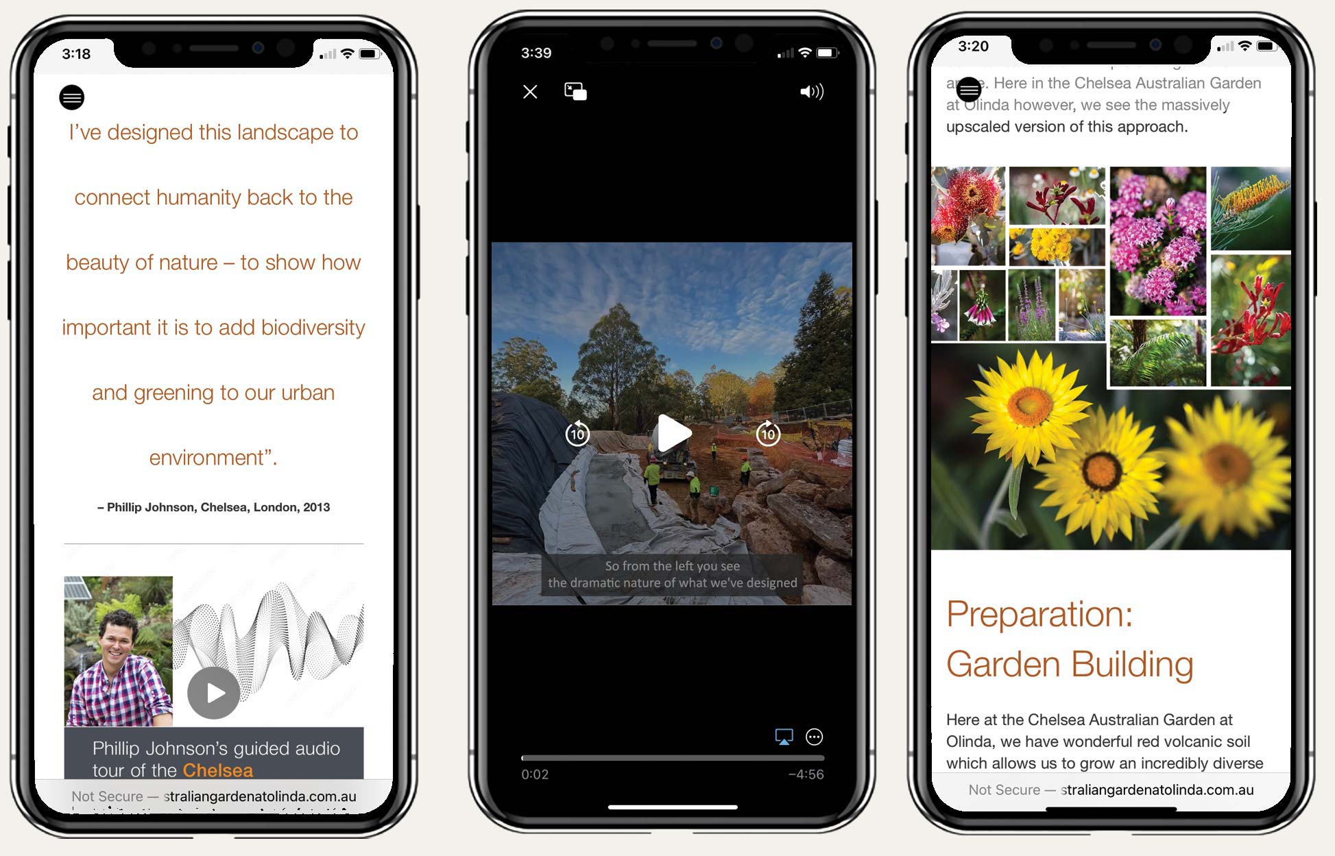
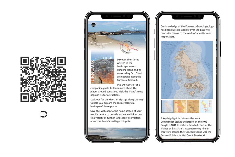
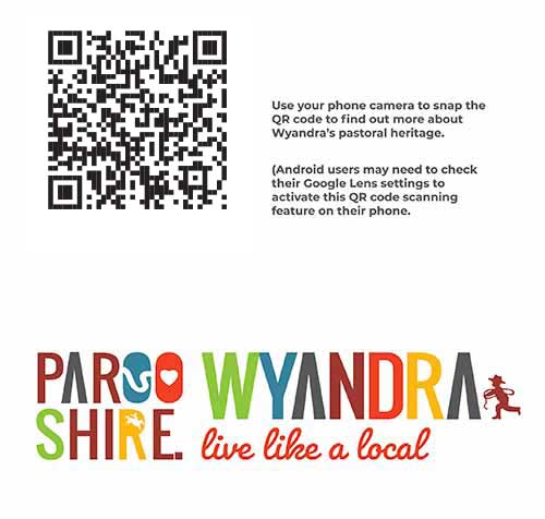
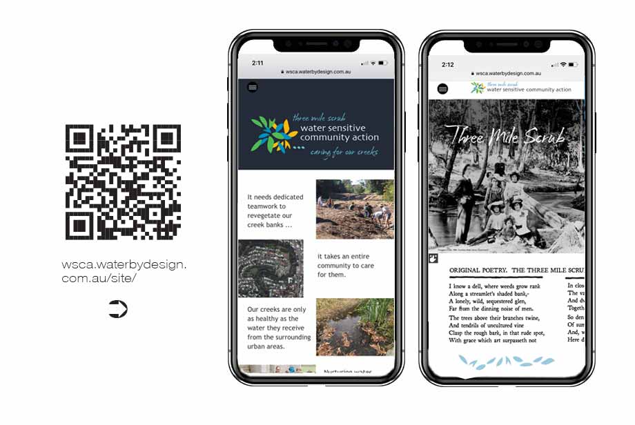
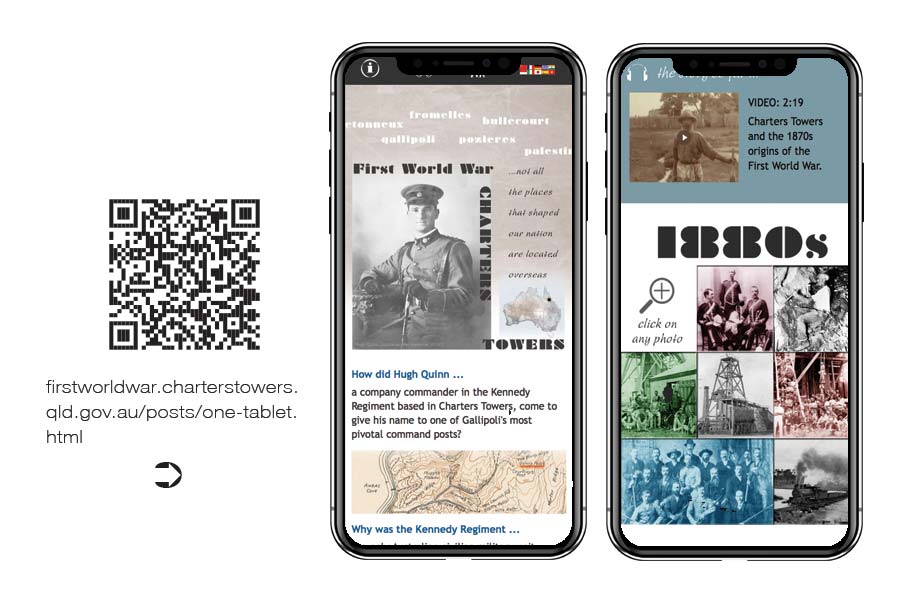
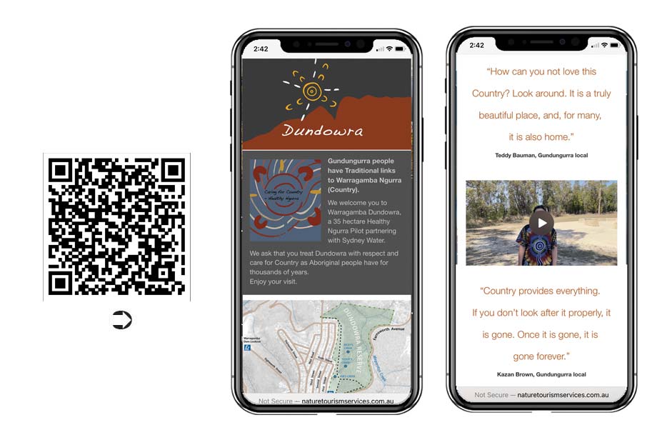
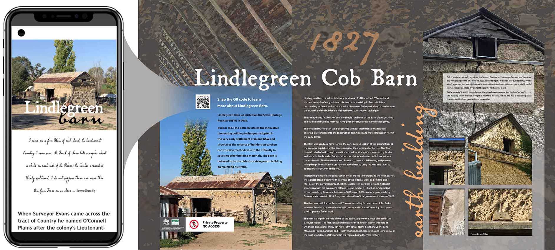
This is why QR codes play such a pivotal role in the delivery of web app content. They ensure that visitors can instantly be taken to a custom page designed to support and speak directly to the overall messages on offer in the precinct around them
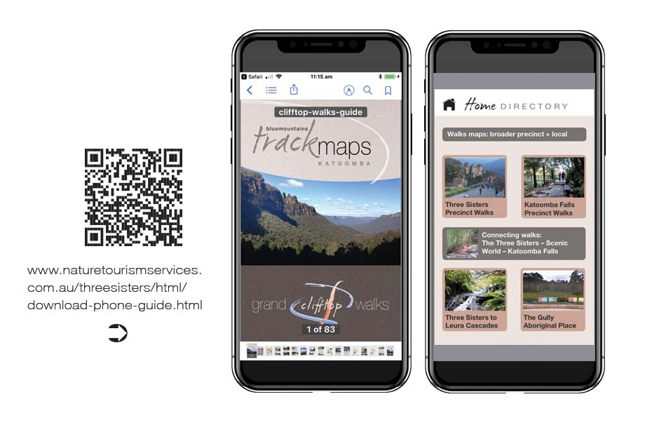
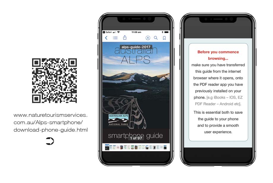
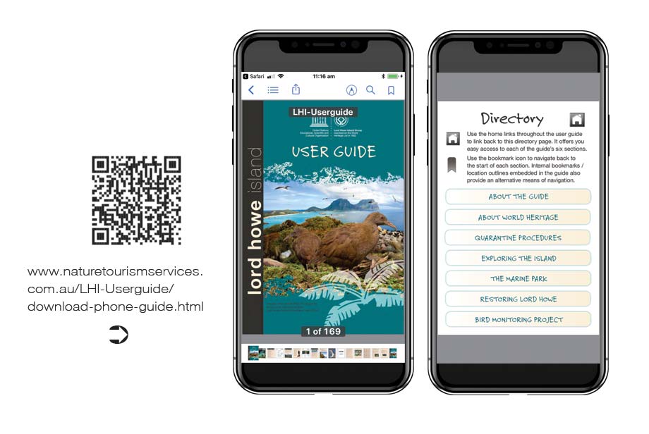
In relation to places remote from internet coverage, managers can still adopt digital strategies. These invite users to download PDF smartphone content onto their mobile devices prior to setting out into remote places. As these are content only packages that are then hosted in pre-installed PDF reader apps, they can be downloaded easily without needing the wi-fi connectivity often required for third party app downloads.
for visitors
Mobile optimisation has changed everything in terms of the level of services and utility people now expect to be able to access instantly in their native language. This phenomena is already in place and is something that will only grow stronger in the years ahead.
Additionally people expect to be able to follow their own lines of enquiry in relation to the information they access. This is at odds with the conventional interpretation and visitor orientation model where people are served up tightly packaged, prescribed information content.
This requires us to move away from providing condensed narratives limited in scope and space by the signage real estate available to deliver them and more towards expansive carefully structured matrixes that people can access from an array of entry points and enquire into at their convenience / interest.
The guidelines for developing new digital product are laid out by the Australian Government's Digital Transformation Agency where it notes that:
You need to make sure everyone who needs your service can use it. This includes people with disability and older people, and people who can’t use, or struggle with, digital services.
Your service must be accessible to users regardless of their digital confidence and access to a digital environment. This includes users in remote areas and users with different devices.
You also have a legal requirement to ensure your service is usable and accessible to people with disabilities.
Multi-lingual interpretive digital solutions operate onsite in areas with mobile phone coverage. They target the space where marketing stops and service delivery begins.
Given the variability in 3G/4G coverage, speed and simplicity of content delivery is the number one priority. This means reducing javascript use to the absolute minimum.
It also recommends prioritising hand coded static HTML pages over dynamic pages delivered by Content Management Systems.
Using adaptive rather than responsive designs to deliver content across a range of screen sizes is also a preferable approach.
When used in conjunction with static HTML, this delivers instant user responses whereby the page loads straight away when called and images download in the background.
The functional advantages of this approach are often overlooked as not all designers are comfortable hand coding HTML pages that exactly cater for the needs of a given situation.
One of the immediate benefits is that static web pages can be handled and published on line as easily as PDF files are.
They can simply be dropped into an assets folder on an existing corporate website.
Here they can serve up their bespoke product with no ongoing maintenance costs as static HTML does not need periodic attention in order to keep up to date with security upgrades.
Once the separate pages for phone and tablet/desktop layouts are built in an adaptive format, they can be easily amended by semi-skilled operatives using free third party editing software like Adobe Brackets.
A key advantage of this approach is that it is a scaleable and cost effective way of including digital elements into interpretive projects.
The only limitation on its uptake is the ability of the interpretive team to customise and develop digital product as easily as they do with print and signage materials.
At Nature Tourism Services we identified this as being an emerging issue at the time of the first iPad release in July 2010.
Accordingly we undertook a vigorous digital research and development program to ensure we could bring the same level of creative enterprise to our digital product as we do to our signage and print media.
In this we have been fortunate to work with selected clients to develop and refine the suite of digital product options we are seeking to share here.